Some of you will have discovered on my blog the article about my home that was featured in the Belgian Interior & Lifestyle Magazine Tijdloos, Spring issue 2010. As Jan and me have decided to advertise in the next issue of this magazine, issue Autumn 2011, I would love to ask for your advice!!
Yes my friends, this is very important to me because it is a paid ad!!
Today I tried to make a lay-out of the ad with the help of the photofiltre app on my PC.
As a lot of my interior design colleagues will know, it’s always so hard to choose the right pictures for an ad! Always discussion and different thoughts !
Which pictures are the most appropriate to present our company and do we have to choose for two or three or only one picture on the ad?!
That’s why I would love to ask for your advice!!
To give you any idea of the character and content of this Magazine, I would love to ask you to click on the image of the cover of this Belgian Magazine Tijdloos.
You will find out for what this magazine stands for.
And if you are interested in reading (so sorry it is written only in Dutch) or watching the pictures of the article about my home, click on the image on below.
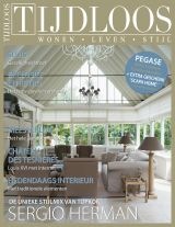 Cover Belgian Interior & Lifestyle Magazine TIJDLOOS, Spring 2010.
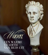 Click on image above to discover the article featuring my home in the Magazine Tijdloos Spring issue 2010.
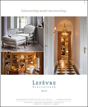 AD Lefèvre Interiors Magazine Tijdloos, Spring 2010
As there is a deadline to deliver the chosen pictures for this AD, I would love to ask you to look at the 12 options that I posted here and to let me know your choice before Sunday, the 10th of July, Midnight Central European Time!
Could you do that for me please?! This would be a big support and help! Believe me!
And there is more! If you let me know which option is the most appealing to you, by posting a comment on this post only (no emails, no facebook comments or twitters!! – I can’t organize it anymore!), you will have the chance to win one the 5 copies of the issue where we will add our AD.
By making your choice, it could be helpful to visit the website of my company LEFEVRE INTERIORS to learn more of my company’s work.
And please keep in mind that this AD will be published in the AUTUMN issue 2011.Your choice can definitely be influenced by considering this.
This issue is to find in the Belgian bookshops from August the 5th on.
So my dear friends, all you have to do is to choose one of the 12 options I posted here and to let me know which one could be your favorite!
All kind of criticism are welcome.
For my not Dutch speaking readers : The saying on the ad “Vakmanschap maakt meesterschap” =
“Craftsmanship makes mastership”
There you go!!
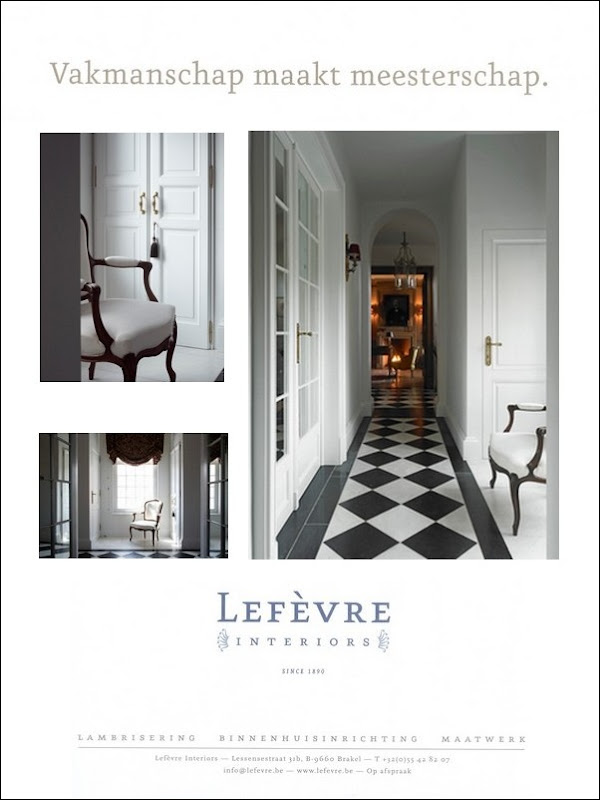 Option 1
Remember, all you have to do is posting a comment on this post (no emails, no facebook comments or twitters) before Sunday the 10th of July, Midnight Central European Time, and you will have the chance to win 1 of the 5 copies of this Belgian Interior & Lifestyle Magazine TIJDLOOS, issue Autumn 2011.
I do hope that even all of my Belgian readers will leave a comment because I am sure they all know this Belgian Magazine!
I would be very grateful to you all!
xx
Photo credits : Claude Smekens, Efie De Grande, Jo Pauwels,
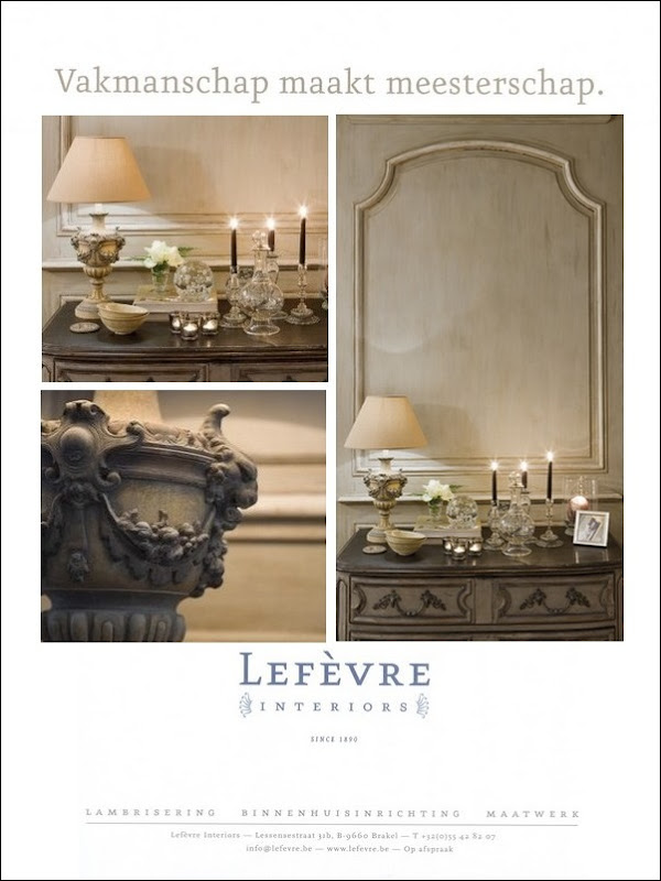
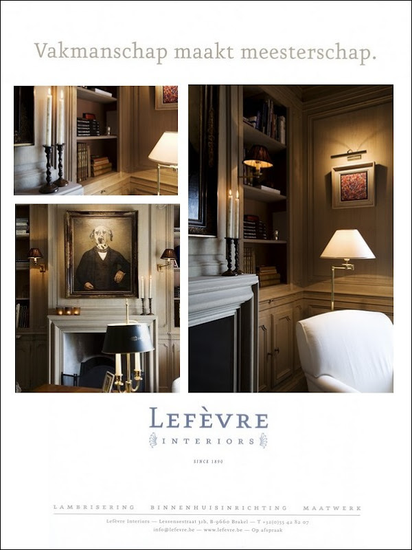

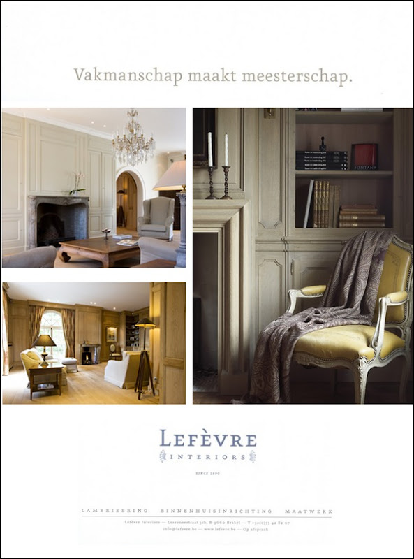
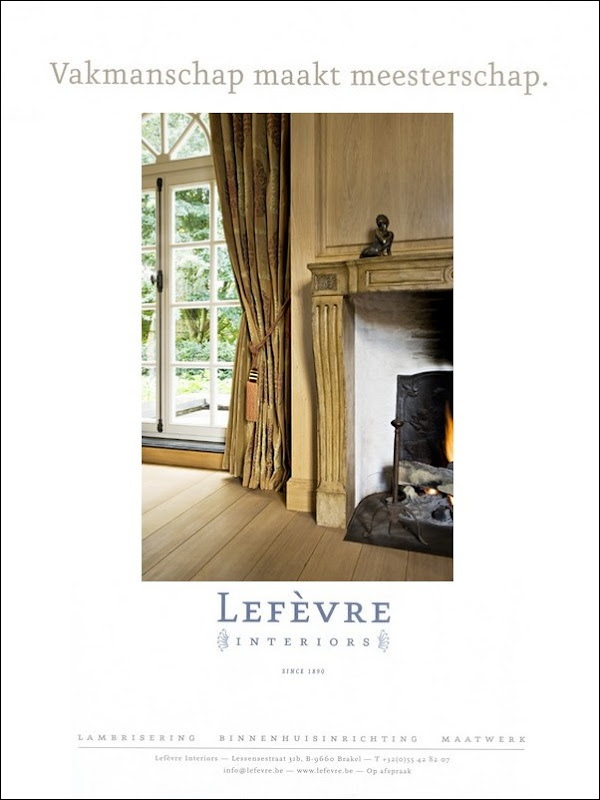
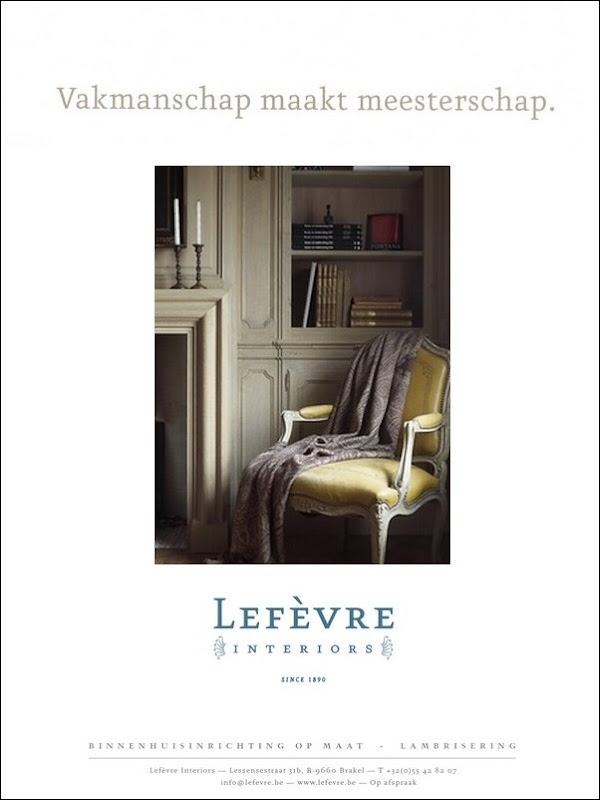


oh my, dear Greet…you have quite the difficult task ahead of you…while your company does very fine work, it is my preference for the ads of 1,2,7…I like the ads with 3 pictures featured best because it gives a little more representation of your companies work..
best of luck,
maureen
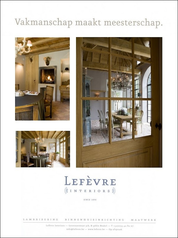
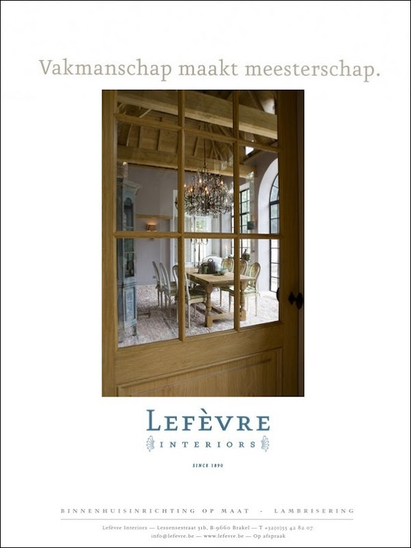
Greet you've given us quite a hard task, as all the options are excellent. I think the one that appeals to me most is no 11. I like the close up of the wood in the door to give an idea of the workmanship combined with the romance of the view through the door to the very inviting scene beyond. Hope this helps and good luck. x Sharon
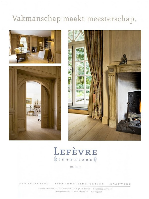
This is tough to answer without knowing the readership, but first of all I love the line about craftsmanship – I think that's excellent and definitely what I have seen of your work so ar! I agree with Maureen – one that shows more pictures gives a better idea of your work. Option 4 would be my first choice for that reason but if possible I'd include more variety to show your span of skills…otherwise I think Option 9 is stunning! Best of luck!
https://bjdhausdesign.blogspot.com/
My preferences are numbers 1 and 3. I really like the first one for its long view down the hallway; very inviting. However, it's all very white. Number 3 shows lovely balance. I agree that multiple pictures work best.
buona sera sweet Greet as its Autumn I think a fireplace should be seen and a pashmina throw ( equivalent of brewed coffee in advertising terms ! I love all of them ,but to showcase your wonderful craftsmanship in different woods ,I think the floors ,wall panelling , shelves and types of furniture should be shown in "big picture " and "fine detail" so i would go for number 8 ,as each has a different feel as do clients and their requirements. hope this may help Lots of love Bon chance fay xxx
Liefste Greet,
Dit heb je weer prachtig gedaan! Mooie voorstelling! Nr 1 vind ik subliem! Nr 11 vind ik ook zeer mooi maar wat mij het meeste aanspreekt is absoluut nr 4!! Ik denk dat je hier een groter publiek mee gaat aanspreken, lijkt mij veelzijdiger. Hoop dat je hier wijzer uit wordt met iedereen zijn verschillende meningen.
Veel succes!
Hier ga je mee scoren!
Veel liefs,
Natalie
Wow you do not make this easy…they are ALL so stunning, you truly cannot go wrong however its a tie between #1 and #2 and I love #7 but two of the pictures are of the same mantle so not sure if that is such a good idea. Truly your work is so amazing, any of these ads will represent your high level of workmanship beautifully. It wil be fun to hear which you choose!
I have only recently discovered your wonderful site so I am rather shy about making a comment – until now I have only read sites and never interacted. Your appeal has prompted me to respond however. I find it a difficult choice but option 2 would have my vote – with number 4 a close second!
I love photo number 1. Its the first time I have seen your company do white. It is beautiful.
To my anonumous reader. Thank you so much for commenting here!! I so appreciate this!! Don't be shy to comment! I just love it! I would love to add you to the list of my chance winners! So please send me your email address!
xx
Greet
To all af my anonymous readers, please send me your email!
xx
Greet
Dag Greet, ik begrijp dat je voor een zeer moeilijke keuze staat. Jullie maken gewoon veel te veel prachtige dingen! Persoonlijk vind ik dat elke optie te veel van hetzelfde laat zien en de lezer niet aantoont dat jullie zeer diverse stijlen kunnen doen. Langs de andere kant wil je duidelijk harmoniërende foto's qua kleur en sfeer. Ik zou de foto's van optie 2 en 4 combineren.Oeps, wordt dit dan optie 13?
Liefs, Saskia
Ohhh, dit is inderdaad lastig. Ik ga voor nr. 1 en nr. 8. Nr. 1 vind ik zelf erg mooi, maar nr. 8 vind ik beter bij de stijl van jullie bedrijf passen. Ik ben benieuwd wat het uiteindelijk wordt!!! Succes met het maken van een keus!
Lieve groet, Ingrid
Saskia,
Dit is nu eens een héél interessant commentaar! Dank je wel!
Groetjes,
Greet
Ohhh very difficult choice Greet, all the options are really very good.
I would choose #1, I love the white tones so clean and clear and also I love the beautiful corner at the window…. always I have liked it very much. The second image I think that's more suitable and warm for the autumn time, the neutral tones create one very relaxed air and it reflects faithfully L.I's work …. so it's my elección:2
Good luck Greet, best desires for you and your company,
Hugs
Cecilia
Wat leuk om hier samen even over te brainstormen! Ik ga voor de volgende opties:
Optie 1: Fris, helder, klassiek, de zwart wit combinatie zal zeker opvallen in de advertentie
Optie 5 : Warm, sfeervol, rustig, prettig om naar te kijken.
Optie 7/8 : Ingetogen, klassiek, warm en stijlvol.
Kiezen uit optie 1, 5 en 7/8 vind ik lastig, ze zijn allemaal even mooi!
Drie foto's vind ik mooier dan de solitaire foto, met drie afbeeldingen laat je net iets meer sfeer en stijl zien.
Lieve groet, Hennie
Option 3 Greet: I agree that the three picture pages are more engrossing, and the colour of the lampshade as well as the over-all warmth of the pictures draw me in.
Option 1 feels cold and the white a little predictable, and the pashmina in 7, 8 and 10 I find too distracting – unless you are selling pashminas!
I love the overall simplicity and directness of your message: Vakmanschap maakt meesterschap, but I suggest “craftsmanship makes mastery” as the translation. Old English teacher.
Good luck!
My husband used to work at a large ad agency and he thought option 1 was the best. I separately also chose option 1. I hope this helps. Good luck!
I love #4 the best. I like the three picture ad, it shows more of what you do. Something about looking through that door into the dining room is really intriguing.
All are gorgeous, but I like #2 and #4 the best! Any chance you could mix the photos from both of them? Good luck 🙂
Beste Greet,
Kijk ook naar de doelgroep die jij wilt bereiken en naar wie dit blad lezen. Daarbij aansluiten is commercieel belangrijk (van de wind kunnen we niet leven toch). Ik heb een abonnement op het blad en zou dan voor ad 4 of ad 7 kiezen.
Als ik echt zou moeten kiezen, zou het 4 worden.
SUC6 en wijsheid, hartelijke groet WIlma
You have worked HARD on putting these options together, I'm sure your head is spinning.
Three-frame option: #3
One-frame option: #11
Good luck!
8 or 4 , I prefer 4 🙂
groetjes, Bram
Precious Greet, I love THEM ALL but I would say option 11. It provides a suggestion into your home…it makes me want to see more…rather than getting many photos in a collage, ONE photo through an enchanting doorway is what I would love to see as a reader. SO LOVELY MY FRIEND!!! Anita
Dear Greet, Option 11 tells the entire story. The windows, of such grand proportions, give away the style and beauty of your home. The chandelier speaks of grandeur and romance. I also like the postion of the door…ready to be opened and be invited.
Greet, you make this VERY hard! They are all so lovely! I was drawn first to Option 1, but I also like Options 8 and 10! All beautiful!
Greet, while ALL of them are beautiful, I love option 3 for the fall issue, it's warm, "gezellig" and klassiek at the same time. {do you also make mantels? If so, this is totally the one I adore!} And perfect for readers thinking about their home and the gorgeous additions your company could make to their homes.
Second runner ups for me are options 1 and 8. Lovely. If you are doing a series of ads {which is always better than once} it would be so beautiful to show a progression. Good luck chosing, it's difficult as they are all lovely. I think you and Jan will know which one you love, and which one most exemplifies Levere. I love this magazine, and beg everyone and anyone who is going to Europe to bring me back a copy!
xo Lidy
Good Morning, Option 1, Is so fresh,clean and uncomplicated.
Good luck. Maggie from Canberra
Good morning Greet. I love options 2, 6 and 8. I love your blog and this is my first comment. I so really love them all but think the ones with multiple pictures shows off more of your work. love Sharne
WOW! I am going to be of NO HELP- they are all so incredibly beautiful! But if I *had* to pick one Id say Option #1- something about the black & white that just grabs you. Its elegant, chic and jumps off the page at you.
good luck picking one!
Hi Greet,
Thanks for asking us!
I have a question for you: do you wish to feature your interior design skills as well as the wood or are you wishing to focus mostly on the wood panelling, etc.?
If you are focusing on the wood, I prefer #5 as it is warm and inviting. However, the photo in the upper left seems a bit out of focus. #1 is also nice if you want a more graphic look.
If you want to feature your interior design and the wood, then I like #2 or #7.
Have fun deciding!
I'll be practical since I know how much an ad costs…a fortune! If it's a full page ad I would go with option 5 since you'll be able to see a variety of wood working and interior design. If it's a small ad I would go with option 10 since the picture will be smaller and you want to show what you do. I hope my two cents helps in your decision but I know you'll do fine! Love all these layouts.
Can you run two ads…so torn between 1 and 6. Adore them all, but these two especially exhibit your spectacular workmanship, to me!! I can certainly say you wouldn't go wrong with any of them…all beautiful ~
Option 10 has my vote! Love 1 but, all the woodwork is painted. I prefer a simple layout the impact is always greater.
I have intentionally avoided reading the other comments to avoid being influenced. But you really could not go wrong with any of the options. That said, I prefer the strong graphic quality of Option 11. However, I would make the single image larger, moving the top line up and the name of your firm down a bit.
Best wishes
I was drawn to 1 and 8, but all are Beautiful presentations of your workmanship! Poncie
Option 5 is the strongest to me. The doors half-closed imply a lot of workmanship.
I feel drawn to 1, 2, & 9. They are all wonderful and I'm sure they're more beautiful in person. Hope this helps.
hello Greet!
As an advertising major I still love looking at and analyzing ads! While all of these are absolutley beautiful I think it important to look at which ad says what your company is about 'at a glance'… for me option 5 shows the most woodwork thereby expressing in a few photos the exquisite craftmenship done by your company. Since it is an issue for Fall I would like to see more of the fire in the fireplace, but other than that I think it makes a stunning ad. Wishing you luck in this difficult decision!
joan
Otion 11. Exquisite chandelier.Texture. Beautiful Belgian design. Natural grain of the wood. Genuine mix of old with the new. Peaking through the door seeing the windows. Luxurious fabrics. Fireplace. Panelling shown. I see there are a lot of votes for Option 1 which is great. However, the wood is painted which features so regularly in advertisements. So the natural wood positions the ad in your mind. Overall brand is featured.
xxxx sherie
They are always gorgeous,but my prefer is option 7
or option 11
Have a nice day
Mari
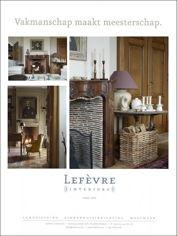
Oh Greet what a dilemma they are all gorgeous! But here goes, I was initially drawn to options 2 and 12 as they are elegant, grown-up and glamorous, but it is mostly the antiques and ornaments I noticed. For me, although they are gorgeous, I would expect your company from these adverts to be selling antiques. Option 3 however, has the luxury, elegance and aspirational styling but also exudes a warmth and is friendly! It is the one I instantly notice the sublime tones of the wood. The textures of the wicker log basket, bricks in the fireplace and pottery add a friendly quality and to me says 'you can have this in your home'! Good luck dear Greet, but I have to say which ever you choose it will be noticed as your interiors are SUBLIME!!!!! Hugs – Glenda xxx
Dag Greet,een héééél moeilijke keuze….ik vind ze allemaal zeer goed! Maar we 'moeten' kiezen en dan gaat mijn voorkeur in eerste instantie naar nummer 1: prachtig zijn de foto's !
Alleen: omdat het een najaarsnummer wordt zijn deze misschien té fris, als je begrijpt wat ik bedoel? Maar misschien is dit net een aandachtstrekker in de ietwat donkerder najaarsdagen?(een dilemma…) Als tweede keuze ga ik voor nummer 4: ik vind de doorkijk door de deur ook een heel mooie foto en de algemene sfeer aantrekkelijk. In elk geval: veel succes met de keuze!We zien wel wat het geworden is.Sabine XXX
Hi greet,
Wel … Ik vind een en twee het mooiste. Is er een rede waarom er veel dezelfde locaties of momentopnamen gebruikt worden per ad? ( zie option 6) je voelt dat het dezelfde plaats is … Tenzij dat het de bedoeling is en dan zipp ik mijn mond)
Ik vind 1 heel verfrissend … Mooi strak . Ik zou slogan bovenaan iets kleiner zetten en beetje hoger. Dan perfect … Verrassend.
Twee ook chic dat het verschillende dingen en hoeken toont.
Voilà … Nu weet je mijn standpunt.
vxx
Veronique
Any one of those would be a beautiful advertisement. If I had to pick one it would be #6. Good luck!
I love all of them, Greet. But here you are asking for help so this is how I see it. My heart is on numbers 1 and 2. But you want to show people what your firm offers I think number 7 is perfect.
And rest assured that whichever you choose it is clear that the love, expertise and dedication are there and people won't hesitate to call you.
Hugs my friend!
I think if you used option 3 but changed the right side larger photo to option 7's larger photo, it would look more complete.
~Dina
Well dear Greet, you have got the blogging world squinting hard at the screen and scratching our virtual heads!! I was going to say #2, then I thought more about your company products and finally chose #4 because it shows several different views and highlights your woodwork and looks so welcoming. Heaven only knows how you are going to sort through all our contradicting advice!
Bon courage
Sharon
x
Option # 1 and Option #3
xo xo
Greet,
This is a hard task, but I tried to see it as which one would make me want to SEE more of your work. Number 5 does that to me. The gorgeous doors half open, half closed makes my eyes want to see more, get inside. That's a great ad! You want people to be curious about your design/company. You want them to want to see more. Besides, those pictures shows perfectly your design and the craftsmanship your company delivers. That essential in this ad. Not only one, but both combined.
I can't wait to see which one you'll choose. You've chosen amazing picture. Lovely!
Have a great day, sweetie.
xo
Luciane at HomeBunch.com
Oh Greet! How lovely to see you come over for a visit!!!! I cannot WAIT to see what option you finally decide upon. Thank you…DANK U VOOR asking OUR opinion! I hope you will have time to visit my next post that I will post tomorrow; you know I always run my post for an entire week…but I am going to share humble images from my little cottage. You are welcome to come into my home to see what a person with big dreams but a small purse can do!
VEEL KUSJES, Anita
Option 4! I love it! The window panes invite you to look closer, and see what is beneath them. It keeps your eyes on the ad longer . . .
Nice job!
Kaci
Dear Greet, I love either 2 or 7. For me, both capture the essential grey-washed colour so redolent of Belgian panelling, and show the texture and quality of the wood you use to best effect. Good luck with your decision! Neil
Bonjour, pour moi c'est la photo 7 qui me plait le plus à la fois classique et mode.
Jacqueline
Greet, the work that you and Jan do is just stunning!!! As far as the Lefevere Interiors advert, I agree with several of your other readers that those with the multiple photos better showcase your work. I think it would have been nice to see one with more of a combination of styles. For example, the No. 4 ad keeping the large photo, but replacing the two smaller ones with one showcasing your exquisite paneling work and the other with one of the vignettes (love the large fireplace scene in No. 3, but not sure if it would work smaller). Your work is so beautiful that the magazine readers will be engaged whichever ad you choose!
Thank you for asking for comments..sooooo smart! I like the idea of one image #11 makes a statement + that all important "Wow" factor. Good Luck to you and will be anxious to know which one is picked. xxpeggybraswelldesign.com
Greet, I've had to make these kinds of decisions and I know you put our hearts & souls into selecting the final image. I love Image 4, it has continuity of style yet it shows 3 different rooms, all with the same lighting. Therefore, the overall impression is one which pleases the eye.
I wish you would use a portrait-style ad with you and Jan seated/standing in one of your awesomely accessorized rooms showing all your beautiful woodwork. To me, seeing the people behind the studio being warm, friendly & professional is very important. Also, you must strive to do something completely different than your competitors, making Lefevre stand way above the ordinary advertisers. I really want to see what you finally come up with. Love….
Hello Greet,
I vote for Option 7. First, I think you need to go with an option that has 3 images, not 1. I know how expensive ads are and you are getting more images to your audience with 3 pictures. The colors in option 7 are warm and inviting, as opposed to cool. The 3 images in this option are actually 3 perspectives of the same thing and show your quality craftsmanship up close, as a focused vignette, and from a whole room view, allowing the reader to actually walk in and around the room, just as if she were there. I love number 7!
I like the ads with 3 pictures featured best!
Year Old Birthday Party Ideas
Option 8 would be my first choice.
I also like Option 5.
The ads with the three photos are best because they show three types of products that you make. To someone who doesn't know your company, they may look at some of your Options and aren't sure what product your company makes and that does no good for you to get a new client. In Option 8, you can clearly determine which product in the photo is made by your company. A lot of the options you put together are beautiful if you already know what your company does. If you are looking to attract new clients, the photos have to be specific. Some of the options I like just because they are beautiful but that is not the point of your ad.
I love many of them, but the two that "sing" to me are 4 and 11. Probably because I love that room (your sister's orangery?), more than I can say. Breathtaking!
Kerry
What a difficult decision! I love them all. I think the options with multiple images are more interesting than the single image options.
I like the images that show the craftsmanship detailing of your work. I'm torn between #5 and #7! Ok, if I have to choose one, then I'll select #7
xo
Brooke
Option three is warm and varied, but I would change the photo in the upper left to a compatible one showing a more contemporary look. That would give more variety to the ad.
I have over 35 years experience in advertising, and am glad to offer my opinion. I really enjoy your blog.
I would definitely show three different examples of work, ideally two traditional and one contemporary, two with warm finishes for winter,and one with a light or painted finish.
Option 4, which is warm and inviting and shows various elements of your abilities.
They are all really beautiful! I like #1, 7 and 2.
Best of luck!
Christina
Good morning Greet,
How exciting! Let me just first say that all the images are gorgeous!
I assume this is for the woodcrafting business (not interior design), right?
If so, then I would really highlight the wood details. (I love the first picture w. the b/w floors – but it leads me to believe that you put in high-end floors!)
I would go with 6 or 7. And as a single one no. 10.
I would also make sure that it says woodcraftmanship since xxx. Otherwise people, who don't know you, will think you only offer design services. But it might say that in the text further down (I can't read your language – although I understand the headline beacuse it almost reads Swedish!).
Good luck my friend. I don't think I was of much help and I already know that what you put together will be outstanding!
You can make my Ad any time! (:
Warm hugs,
Mon
P.S Try putting the "dog picture" in no. 6 into no. 7 (at the bottom). It might add some more drama to ad 7. I know they are different sizes but perhaps you can tweak it.
Greet,
BY FAR OPTION 1 !
Why ? It is fresh and in-sync with the latest trend towards more pure and white interiors. I think Tijdloos is too much about brown/yellow/grey oak colors, so with these pictures you will differentiate from the rest, which is the intention of marketing.
cheers,
Luc.
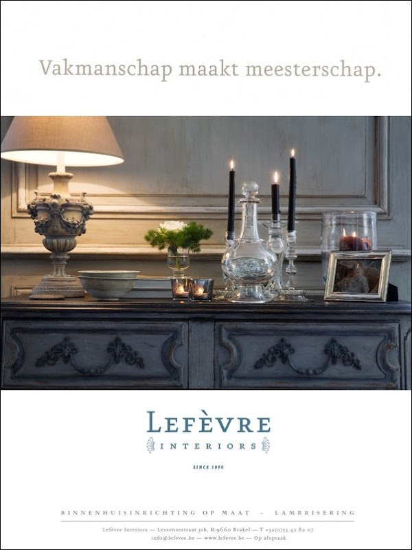
It is true, they are all beautiful, but I am torn between 2 and 11. 2 is a beautiful vignette that features classical items that are very appealing. 11 shows so many elements of both design and architecture of grand proportion. Absolutely forced to choose, I would have to say #2. All the best to you.
For me: definitely No 5, eventually No 9.
I like a rather 'simple' but at the same time stylish ad. And at the time I was advertising in Interior magazines it worked always best.
Bonne chance
Karin
I deal with this problem all of the time with my own business, Nantucket Home. It's important to show what you do but also important not to confuse the reader with too much detail. Therefore my first choice is #11. It shows your product but in an interesting angle. Using one photo with the white space around it is also preferable to me. Good luck with your decision!
Greet, they're all beautiful!!! I like nos. 5 & 7 best because they show interior design as well as details on your custom woodwork. (I also love the first ad.) I hope our feedback help. Good luck!
Greet, if you want a 3 picture ad, my first choice is #8. This one shows the beautiful wood floors which make up a large part of the home and is an essential design element & the up-close patina/detail of your company's woodwork which sets you apart from other companies. If you want a 1 picture ad, my first choice is #11. This one invites readers to "view" your company's unique architectural design through the beautiful, multi-paned glass door, which frames this light-filled room!
For me: number 5!
It is inviting to enter the image, to know more. It doesn't show everything at once. It is very classy and plastic ( estetic) and not over filled. Then further, I'd show more sensual textured details. Good luck! Great work!
No. 2 – as an art director it is important to convey what you are selling quickly
one is nice but too white and not sure are you selling floors? chairs?
SO – that said Number 2 is warm and clean and romantic…
the finish on the walls and chest are stunning
and the close-up of the items make it very clear about your level of craftmanship.
– three items per page for sure…variety pulls in more buyers.
-overall they look clean and lovely!
maurie3@gmail.com
I personally like one single stunning image (of which you have many), but I'm really drawn to #9. I also love #10, and it shows such beautiful detailed work.
So many beautiful images. What a difficult choice!
Jane
OPTION 6 for the color, lighting & mood.
I figured out the English translation of the Dutch word Tijdloos (Timeless), but what's the phonetic pronunciation? Does it sound like a city in France…Toulouse?
Definitely the First one! It is clean and fresh, with hints of elegance, and allure! Shows possibilities of several styles you are capable of doing. I loved all your pictures, but some looked a little " been there, done that! " Option 1 it is!!
Florida Designer
Dearest Greet, You cannot go wrong with any of these. they are all beautiful images as your work certainly is. However, I definitely like the 3 images the best if the ad is big enough for it and #7 would be my choice because it really showcases the beautiful wood work that you do. It's going to be a great ad regardless of your choice. Mona
All of the vignettes are striking! After considering when the ad will run and the message you are trying to convey, I prefer option 5. The composition exudes warmth with the natural materials on display. Furthermore, craftsmanship is highlighted in the construction of door, frame and mantel. All in all it is very rich! Beautiful job.
Wow, they are all beautiful! I would have to say option 1 is my personal favorite, but to show off what you have to offer, option 5 has that wonderful and amazing arched doorway and 7 is so warm and inviting.
Greet, If you're going to spend the money to place a full page ad, it needs to rise above the visual clutter of the other ads in the magazine. It has to be so visually and emotionally striking it will make the reader stop to look at the picture and take it in. Sally's and my experience with print media is it needs to be Big, Bold and Beautiful – a single image.
Number 10 does that for me. If you can do it with less white space and a bigger image, all the better. It is a spectacular vertical format shot. Let it sing!
Here's hoping your ad generates lots of calls and new business!!
Cheers,
John
So hard to decide and all the comments are great. I'm drawn to #3 and #6. While the shots from the perspective of being outside/looking in are nice, I like the interiors so much that I want to "be" in, an insider if you will! #3 has multiples, a variety of wood colors and a greater sense of balance between feminine & masculine than my other favorite #6. #6 has spectacular, classic light and is very calming. (#12 is stunning, but I do like a larger room focus.)
This is tough – I find #7 appealing. However, they all look beautiful and will represent your firm well.
Loved reading your post about Brooke's visit. It looked like a wonderful time.
I like option 5, Greet, because I think it covers more the scope of your work as well as being lovely. (I asked my three Cavalier dogs and they liked it best too and asked to send hugs to Ralph.) Really, any one you choose will be perfect. They are all wonderful. Sallie
Option number one is fresh and on trend while being timelessly elegant and very appealing. It doesn't have too many photos, books and blankets cluttering things up, but displays your work grandly, so it is my first choice. I also find the images in option three attractive but find that my eye is drawn mostly to the basket and art and less to your wood work. Option nine is my favorite option out of the single images because it highlights the woodwork with few distractions. Looking over them again I've noticed that my preferred images all have natural light shining in them which helps to keep the images from seeming dark and stuffy.
Zij zijn allemaal zeer goed. As some of the settings are already included in the article I think that picture 5 sums up what appears to me to show what your company is so good at. That to me would be most important, I love the doors behind the archway.
Option 5 I think had the best views of the versiltility of your companys work. Having too much furniture in some of the other shots obscurs the view of the woodwork.
Greet, I liked #8 as it showcased your work in 3 different settings and showed the "breadth" of it.
I like 1 and 7. All are beautiful so you can't go wrong.
#4 and #11
Greet,
My preference is definitely number 1 because it stands out because of the color palette. The other ads are beautiful too but this one really grabbed my attention.
Antoinette
I vote for 4 and 10! All 12 are beautiful; however these two display exceptional craftsmanship and design. I might favor 10 because it combines the artisan craftsmanship (mastership) with the elegant refined eye of the very talented interior designer.
option 1 – a good crisp representation!
Hi Greet,
They are all lovely but I like Option 7 the best for an advertisement.
First, it's a great representation of what you do. The detail of the fireplace surround is wonderful and it shows me (the reader and possibly customer) the level of your ability and craftsmanship in a cohesive way.
And the colors are very inviting as well.
XO,
Amy
Greet, personally I like #7 the most, however from a marketing point of view I think #8 shows the breath of Leferve the most
Bonsoir Greet,
Het is wel een moeilijke keuse, maar ik verkies option 8.
Groetjes
Jérôme
Number "1" absolument!
Bonsoir Greet,
a votre place je choisirai entre les options; 1, 8, 10 ou 12 car du point view comme grafic design et presentation publicitaire les 4 options sont plus favorable.
bonne weekend!
Jitka (Luxembourg)
I like 1 for its dramatic effect. But I would like the spacing of the pictures without so much space. And I like the simple look of 10 (my favorite color is yellow, so this speaks to me) because sometimes just less is more.
My favorites are (in order): 1, 9, 10. They looks wonderful and have a elegant feeling.
Good luck !
xo
Anci (The Lighthouse)
Hello,
option 1 for me: clean, elegant epitomizes beautiful Belgian touch
best of luck with choosing and don't forget go with your heart…
All of these images are beautiful. Option 1 and 7 seem to catch our eye most. Option 7 is a great representation of your company’s craftsmanship. Hope this isn't confusing but…we probally would take the top left picture from option 8 and use it to replace the bottom left of option 7 to see what it looks like. All of those images are such great represenations of your company. Can't wait to see your choice. XO Angela and Renee
All the images are appealing. i am torn between 1 and 7 – for an Autumn ad placement i have to go with 7. look forward to seeing the one you select in print
Goedendag,
Ik vind 4 en 11 erg mooi!
Succes!
Hartelijke groet,
Ineke Hoetjes-Koorn
http://www.vledderhof.nl
First and foremost congratulations on the beautiful article. I posted it on my FB and Twitter pages, but could not find you to link.
As far as the ad goes, that is a hard decision, as all the images are beautiful. I like 7 with the top left image from 8 to show more of your work.
Cheers,
Claudia
Greet,
Zet ze er maar allemaal in, ze zijn allemaal heel mooi, maar als ik echt moet kiezen dan ben ik fan van optie 1.
De kleurencombinatie zwart – wit wordt heel mooi weergegeven in deze advertentie.
Doe voor mij maar optie 8, de verschillende stijlen spreken mij wel aan.
Heel veel succes!
Groetjes,
Marie-Jeanne & Sandrina
Well, you certainly have so much to consider, especially after all of these wonderful comments. When I look at an ad in a magazine, I like to see more images, so 3 images in this case have a better impact. What I do like is an ad to sell/tell a story, I love to be engaged in a sense, where the photo "draws" you into a space, but not necessarily "giving" the whole picture away, but making you want to "see" more, therefore leading me to your web site or requesting more literature..I love to see a very close-up image of a specific detail, then expanding that image, then yet again, but still with some refrain, leaving me "hanging". All the photos have a fall/winter feel, I love the "voyeur" view to look into a space thru a door, window or reflection in a mirror. Showcasing the wood to where the reader wants to touch it, is very enticing. During the fall/winter season, we love to be warm, cozy and of course eat so my choices are drawn to some more than others. I want to run my hands on the wood in photo number 5 lower left and walk inside the space. I want to go inside the room in number 4 and also cozy up to the table next to the fire in number 4 upper left, and I love the craftmanship in detail in photo number 7 upper left…photo number 1 is a winter song, stark contrast, put this in a french magazine with a model in an eggplant jewel-toned colored voluminous ballgown…
Greet, all these ads are beautiful in their own way. My favorite is Option 10 because I think images shine when they have lots of white space around them. Shelter/design magazines always appear so cluttered to me, which makes the clean, open design of your single-image ads stand out from the crowd. It may seem ridiculous to pay for blank space (I know how expensive magazine advertising can be!) but it is all about making the reader pause and say "Wow!" Best wishes! Donna
My favorites are 3 and 11. I number 11 I'm lured by the promise of a wonderful room beyone. And in 3, the texture of the fireplace and the basket use a little tension to be provocative. I don't like the cold white hallway photo and some of the others feel like things I've seen before, even though they aren't.
All lovely…what a home!
I 'm coming to Belguim in a couple of weeks and can't wait
to check out the design stores!
Greet, all your pictures are exquisite, hard to choose but my opinion is (in this order)
# 1
# 10
# 7
I prefer one image only or three of the same room (as in 1) sometimes less is more intriguing and if people are attracted to the image they can check all you have on the website.
Have fun exploring and choosing between hundreds of comments!
Hi,
I love your blogg and your new ads. When posting an ad it is important to have more than one picture if possible. You show so much more. Also showing different furniture and styles are important, appealing to different taste of the readers. Ypu wpild like to attract readers with apartments as well as houses, small and big so it is importnt you have "something for everyone" attracting different houseowners. All the pictures are fabolous, but each in their own way. To post an ad attracting as many interesting readers as possible I believe number 4 is best since it shows different styles and furniture, for small or big places. Looking into ones room is also an eyeopener and gets you curious to see the rest of your production. With this ad you cn dream big but you can also buy sometging smaller and treasure that in your place.
My choice is number 4, after that number 7 and 1. It is important to shoe not just real dark furniture but not only white as well since it does not fit in everywhere.
Good luck and the wishing you the best. Ingrid from Sweden.
Number 1 or 3. Lovely blog thankyou. Good luck with the advertising.
I had number 1 in mind until I scrolled through and saw number 10. So my vote is for number 10. Simple, elegant, attainable, only takes a moment to sink in.
Hi Greet,
I know I'm too late to win anything, but I wanted to say that I love option 1 and 4 the best. That was very difficult because they are all amazing, truly amazing examples of your companies beautiful workmanship.
Hugs, Cindy
I suggest # 4.As a design firm you have shown a range of sophisticated textures – 2 examples of rustic flooring, 2 examples of window/door treatments (steel and wood),at least 3 different lighting techniques as well as natural light, incredible ceiling details, and then you have added an element of nature – fire. (water would have been great) The monochromatic coloring lets the eye absorb the details of the mastery of your firm's wood work. Very appealing!Congratulations!
Hi Greet.
Could you do the following:
Option 1 seems so popular. But can you not combine
Option 1 White Hallway
Run the hallway on the right large format.
Lefthand side: Include the photograph with the glass windows and the door and chandelier
Run a 3rd photograph: The yellow chair with the throw?
Just a thought. X Sherie
#3 followed by #10 followed by #1.
The photos are just marvelous. The layouts are clearly very professional. What I looked for was a clearly defined idea in the layouts – less detail and elimination of any clutter. Good luck with your ad.
Love your blog. Ann
Greet, Something with Woodcarving on it 😉